
-
Original Atkins report data doesn’t add up, and is full of holes.
-
PHE’s method of presenting data is unscientific and misleading, and appears designed to minimise the levels of toxic emissions.
-
Average levels of benzene and naphthalene at the southern boundary near the soil hospital have been up to 2 times higher than the legal limit for at least seven months.
This is a follow-up post to my previous PHE cover-up note.
Here is a graphical representation of what my earlier post found - increases in toxic emissions, over and above the legal limits:
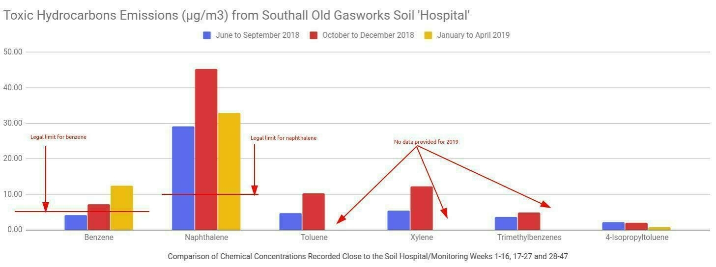
All data taken from Public Health England’s three reports
It’s important to note that the above graphic uses data averages from ALL site air monitors, so values are LOWER than they would be for, say the two monitors closest to the soil ‘hospital’ (and my home).
Increases in toxic air
This is cause for concern in and of itself. Berkeley Group, we have been told, put extra measures in place to reduce odour and emissions of toxic air.
But the result is the opposite - more toxic air than ever before (Berkeley didn’t bother to record individual hydrocarbon emissions prior to June 2018. Or if they did, they are not releasing the data.)
PHE’s third report, published somewhat (in)conveniently the day before our public meeting on 10 July, made no mention of these increases, and in fact did not even publish the data for the third period from January to April 2018. I wonder why?
More covering-up
So, I thought I would look again, more closely, at the data provided in the original (who do the actual air quality monitoring), and at PHE’s subsequent three reports.
What I found is truly shocking.
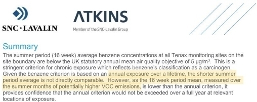
Atkins led us to believe that the summer months would be the highest levels of emissions
Location of air quality monitors:
Air quality monitors ‘ES014’ and ‘AIR 1’ directly to the north and north-east of my home
The data in some of the tables provided by Atkins simply doesn’t add up:
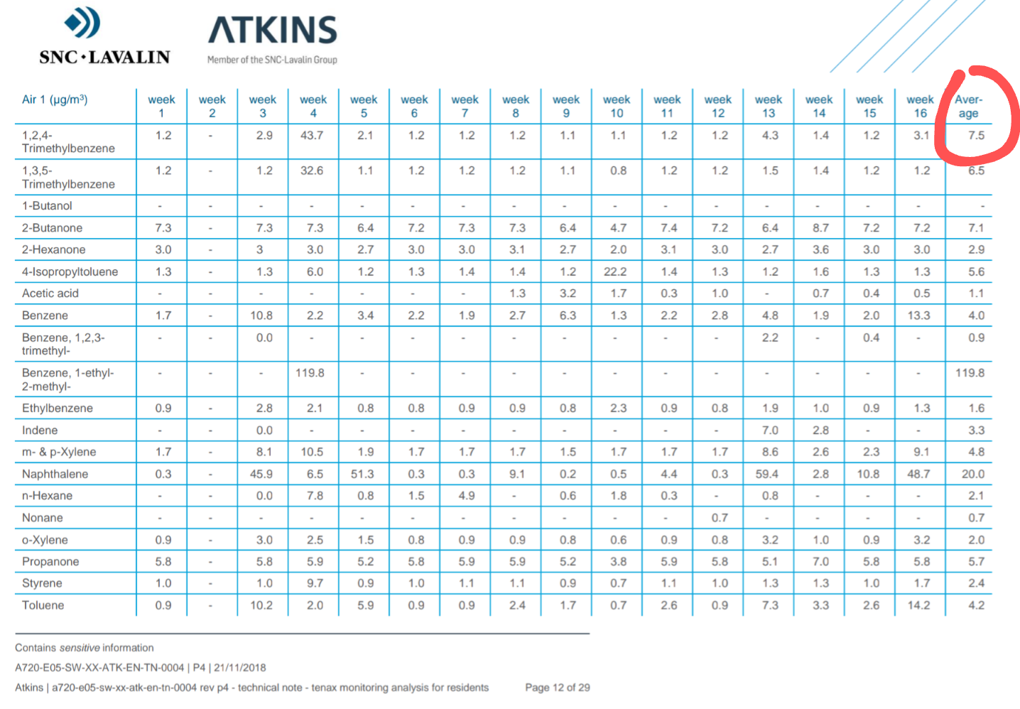
If you add the weekly figures in the highlighted row together and divide by 15 (the number of weeks with data), you get 4.5 average not 7.5
What’s concerning here, is that PHE used the correctly calculated averages. I know they did, because they are the same averages I calculated from Atkins’ data.
The question is, how did Atkins come to present incorrect (mostly higher) averages than the data provided shows?
My own theory, is that they removed some data showing very high levels, but forgot to adjust the average. That would explain the missing data in week 2, for example.
This would also make the overall picture look even worse than it already does.
I haven’t checked all the data tables provided by Atkins. There is one table for each monitor, in a PDF. I asked Tony Pidgley for the data in spreadsheet format, but he failed to deliver on that simple request. It takes a long time to transfer the data from the PDF into a spreadsheet manually.
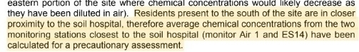
What I did look at is the data from the two air quality monitors closest to my home - ES014 and AIR 1 - about 150m to the north and north-east.
These are also the two monitors which PHE used the combined data from to show the levels ‘at the soil hospital’ in their first report (p. 5).
PHE refer to monitors AIR 1 and ES14 [sic] (ES014)
These air monitors are really quite close to my home.
Soil ‘hospital’ emissions
Even more concerning about the data PHE have published, is that they are not comparing like for like, and appear to be deliberately trying to minimise the published levels of toxins in the air:
-
For the first report, the data for the soil hospital used data from two monitors, AIR1 and ES14.
-
For the following two reports (from October 2018 onwards) they included data from another three monitors, two of which are further away from the soil ‘hospital’, and therefore likely to give lower readings. I say likely, because the data hasn’t been published, only a summary.
-
The final report, for 2019, includes 4 weeks of data when the soil ‘hospital’ had closed, further diluting the data, and having the effect of further lowering the published averages.
-
Since the soil ‘hospital’ closed, three new off-site monitors are located, one in Minet Park to the north-west of the site, and two in Randolph Road to the east, and behind several rows of houses. Again, including data from these sites further reduces the overall site average.
-
The above is all highly unscientific, and again I wonder what was their motivation for doing this?
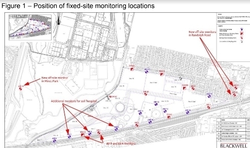
Locations of additional on and off site air monitors
There’s probably other stuff I’ve missed, and I haven’t looked at the data from the other air monitors located near Blair Peach Primary School, or elsewhere.
One aspect of the Atkins weekly average data I noticed, that struck me as being odd, is that while levels of benzene and naphthalene varied quite wildly from week to week and between AIR1 (above) and ES14 monitors, readings for other chemicals are often exactly the same at the two locations and in some cases for consecutive weeks. Maybe that is possible, but it just seems to me unlikely, and therefore raises more doubts about the integrity and validity of what we have been told.
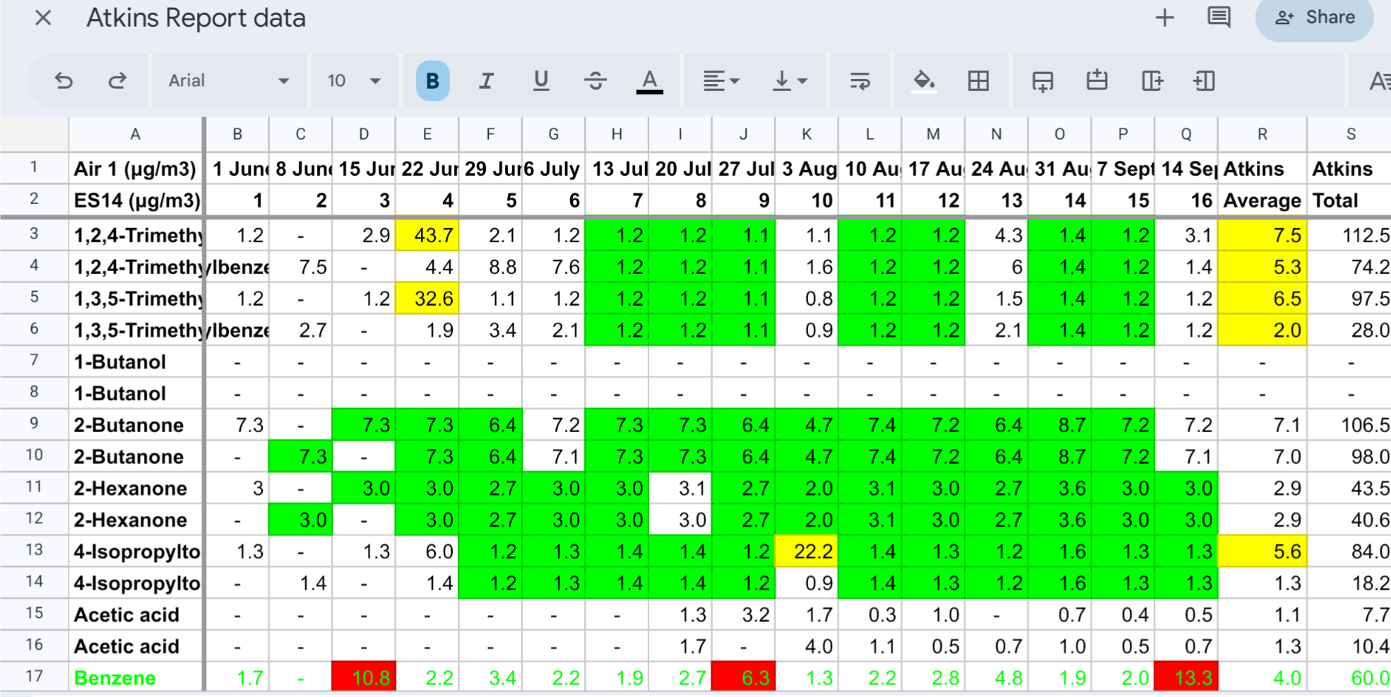
If you’re interested, you can see my Atkins spreadsheet.